When you’re working with images, file size can quickly get in the way. This often happens when uploading a photo, attaching it to an email, or trying to keep a webpage from slowing down.
If you need to compress JPG files, a tool like QuillBot’s Compress JPG can help: it reduces JPG file size while keeping the image clear, so you can share, store, or publish it more easily. In just a few clicks, large images become more compact and easier to handle.
The color name gold encompasses a range of warm yellow, yellow-orange, and brownish-yellow shades associated with the precious metal of the same name. Objects and surfaces described as “gold” typically have a metallic quality—produced using paints or coatings with light-reflecting properties and conveyed in drawings or on screens through highlights, shadows, and gradients.
This article explores the meaning of the color gold and presents metallic gold color combinations—including gold hex codes—to help you build a gold color palette for your project.
TipYou can use QuillBot’s free online AI Picture Generator to create a mock-up image of a gold-colored object.
Key takeaways
Gold is a warm, metallic color associated with luxury, success, prestige, and lasting value, making it a powerful choice for branding, interiors, and visual design.
This guide explains what gold symbolizes, shares key gold hex codes like #FFD700, and presents gold color palettes to achieve different moods—from glamorous and exclusive to warm and sophisticated.
The letter O has one of the simplest shapes in the alphabet, and it’s extremely common in English words. Yet, it’s anything but ordinary and invites closer observation. Its circular form offers a surprising range of design possibilities. And as the starting point for words like “ocean,” “oasis,” “omen,” and “octopus,” the letter O inspires powerful storytelling.
When the letter O plays a central role in a design—like a logo, crafting project, or presentation slide—understanding its form and flexibility leads to high-quality results.
This guide explores the letter O’s origins and typography, along with design ideas and words that start with O. With QuillBot’s free Image Generator, you can explore letter O designs for any type of project.
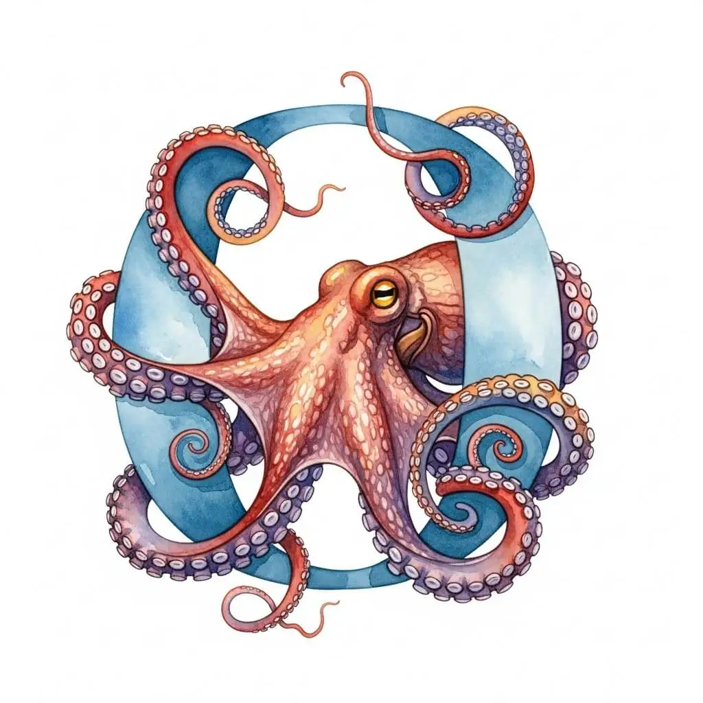
Letter O design from QuillBot’s Image Generator
Key takeaways
The letter O stands out for its visual consistency across history, from ancient Phoenician and Greek alphabets to modern typography.
Understanding the anatomy of O helps designers make informed choices.
Variations in typography (shape, stroke contrast, and proportions) allow the letter O to convey different moods.
The letter O offers broad creative potential in design and storytelling, with versatile styling options and a wide range of impactful words for branding, art, and content.
Burgundy is a deep, rich shade of red that’s bold without being loud and combines well with deep greens, yellows, and blues.
If you’ve found a burgundy color palette you like in an image, upload it to Quillbot’s free Color Palette Generator to find out the codes of the main colors in the image.
Key takeaways
Burgundy is a deep, purplish wine red that conveys sophistication, authority, warmth, and quiet luxury without feeling flashy.
This guide explains what burgundy symbolizes, how it differs from maroon, common hex codes to use, and practical color palettes for branding and interiors.
Before you dismiss brown as dull and boring, it might be worth giving it a second thought—especially if you’re looking for a color that communicates authenticity, reliability, or subtle sophistication.
This article explores the meaning of the color brown and presents a range of brown colors and color combinations to help you create your own brown color palette.
TipYou can use QuillBot’s free AI Photo Generator to visualize how brown could look in your project.
Just prompt the generator with a description of your design and ask for a rendering in brown (e.g., “Show me a mock-up of a modern reception area that uses a brown, cream, white, and gray color palette”).
Key takeaways
Brown can make designs feel natural, warm, honest, and quietly sophisticated.
In branding, brown is useful for communicating sustainability, craftsmanship, heritage, and reliability
In interiors, brown helps create cozy, welcoming, timeless spaces.
Explore the brown hex codes and palette ideas below to find combinations that feel earthy, elegant, or subtly luxurious.
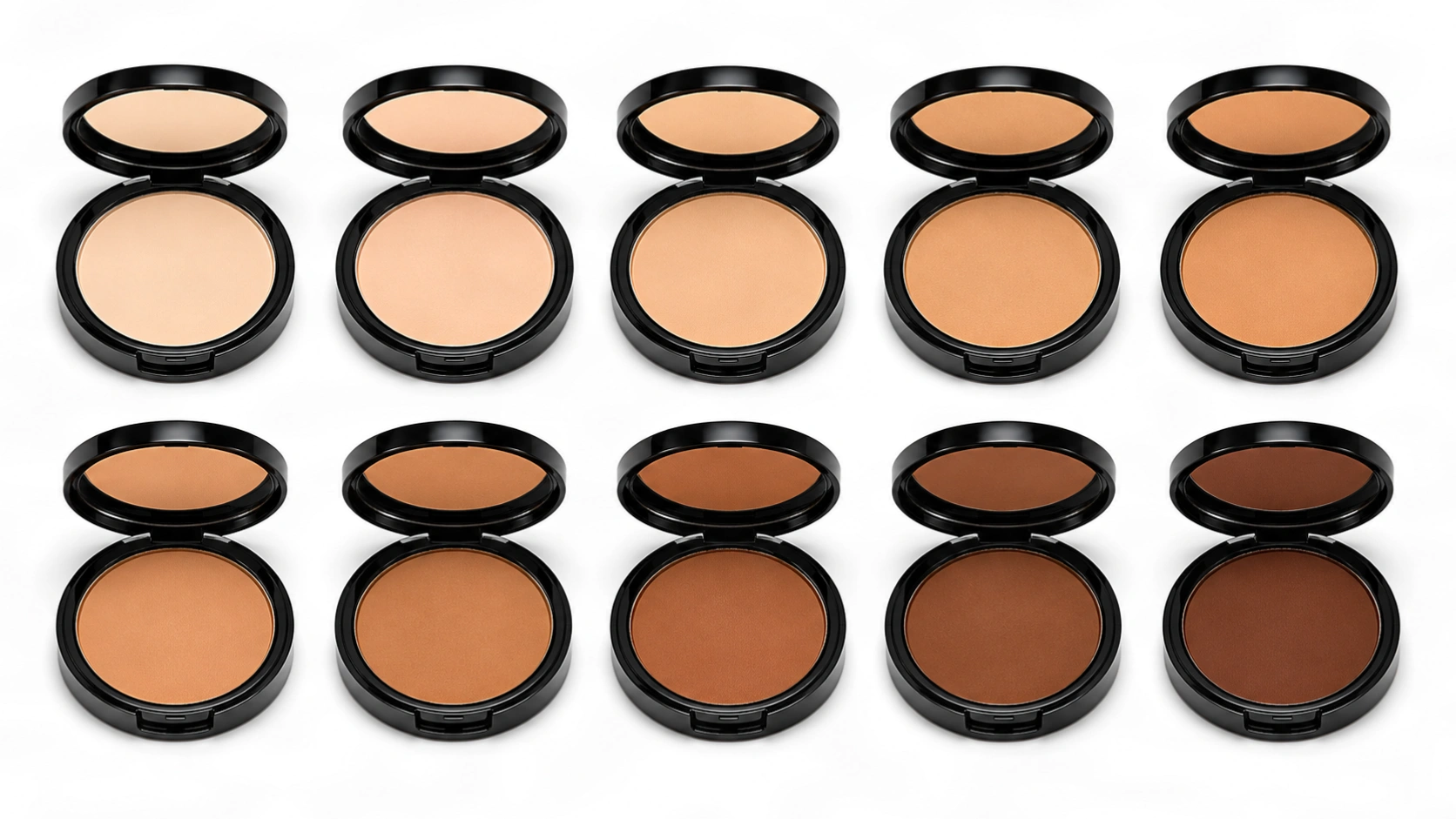
The term nude describes the color of products like makeup, clothes, and bandages whose color is designed to blend with the wearer’s skin.
You can visualize different color options for your products using QuillBot’s free AI Photo Generator. Just describe your product and color idea in the chat and ask for a mockup photo.
Key takeaways
“Nude” isn’t one specific color—it’s a term used to describe a skin-toned shade designed to match or blend with a specific complexion.
Manufacturers of nude-colored products (e.g., makeup, clothing, underwear, and bandages) often offer them in a range of “tones” (e.g., light, medium, and dark) and “undertones” (e.g., cool, warm, or neutral).
If you’re a business builder wondering how your competitors are creating such professional-looking posters, the answer could be that they’re using a solution like Quillbot’s free poster templates.
From tutors and consultants to real estate agents, event planners, and market sellers, one-person business owners are turning to poster templates to design polished marketing materials that make a strong impression on their customers.
Read on to find out how you can use poster templates to connect with your clients and customers.
Translate PDF tools like Quillbot’s free online PDF Translator save you the hassle of having to manually copy and paste the content of a PDF when you need to translate it into English or another language.
When you’re faced with a long PDF that may or may not contain the information you’re looking for, AI tools like Quillbot’s free online PDF Summarizer can save you time by providing an overview of its contents. After you summarize a PDF, you can also ask follow-up questions to locate specific information in the document or clarify parts of the summary in more detail.
When selecting a blue for a project, going for a darker shade can help emphasize qualities such as trustworthiness, competency, and luxury.
This article explores the meaning of dark blue, showcases a range of dark blue colors, including their hex codes, and provides inspiration for using dark blue as part of your brand identity.
If you’ve found an image containing a shade of dark blue that you like, you can use Quillbot’s free Color Palette Generator to extract the codes of the main colors in the image.
Key takeaways
Dark blue is a strong choice when you want a design to feel trustworthy, professional, and refined.
This guide explains what dark blue symbolizes, shares popular shades and hex codes, and offers ready-to-use color palette ideas for branding, interiors, and polished visual design.